How To Read Candlestick Chart For Day Trading
Comment
How To Read Candlestick Chart For Day Trading
If you are trading without looking at price charts, you are just shooting in the dark. Price and Volume are the two most important inputs for technical analysis. They form the basis of all technical analysis. Price charts help to analyze price and volume data in visual form.
A Candlestick chart is the most popular form of price chart used by traders. In a candlestick chart, the price graph is represented in the form of a series of candles, hence it is called a candlestick chart.
Candlestick chart conveys useful information like the trend, bullishness/bearishness, volume at a simple glance.
The chart is made up of red and green candles where each candle gives information about opening, closing and range of trading prices within a particular time frame.
Even if you are not a trader but a long-term stock investor you should have knowledge about the candlestick charts. Because no news or other internet sources will give you more useful information about a stock than its price chart.
You can understand the trend of a particular stock and also find an appropriate entry/exit point by reading candlestick charts.
What are Candlestick Chart Patterns
Candlestick charts are made up of red and green candles.
Each candle represents the range of prices during a particular time period. In a 5-min candlestick chart, each candlestick represents a 5 min period; in a 10 min candlestick chart, each candlestick represents a 10 min period and so on.
Green Candles represent that the closing price at the end of the time period is higher than the opening price.
Red candles represent that the closing price at the end of the time period is lower than the opening price.
Let’s say you open a 10-min candlestick chart of stock at 9.30 am when the price is Rs. 230. If the price goes up and ends up at Rs. 233 at 9.40 am, the candle formed will be a green candle.
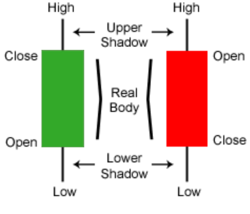
Candle body – The highlighted portion (green or red) is the body of the candle which denotes the opening and closing price. So, the lower end of the body is the closing price in a red candle and the upper end of the body is the opening price.
Similarly, the lower end of the body in a green candle is the opening price and the upper end of the body is the closing price.
Candlewick – the upper shadow and the lower shadow represent the wick of the candle. The wick of the candle denotes the range of prices at which the stock has traded in that time duration.
For example, if the price had gone up to Rs. 234 and gone down to Rs. 225 in the 10 minutes, the length of the candle wick would have been from 225 to 234. And the body formed will be in the price range of Rs 230 & 233.
24 Candlestick Patterns to Learn for Intraday Trading
If you have read and understood the article so far, interpreting candlestick patterns will be a cakewalk for you. There are many candlestick patterns. We will be covering some common candlestick patterns that you can learn to start intraday trading in this article.
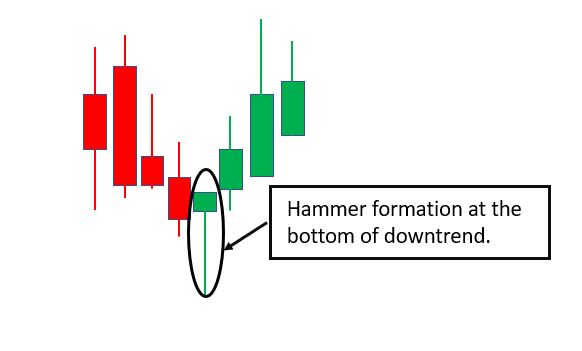
#1. Hammer Candlestick
A Hammer is a bullish signal, consisting of a short upper body and longer lower wick. It indicates that the prices bounced back even after selling pressure. Thus, a hammer at the bottom of a downtrend indicates that the trend has changed to bullish.
Both red or green hammers are bullish indicators but green hammers are stronger bullish indicators because it means that the buyers are gaining control.
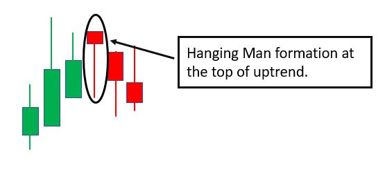
#2. Hanging Man
A hammer formation at the top of an uptrend is called a Hanging Man and is a bearish signal indicating the end of the uptrend. The long lower wick indicates that the buyers have tried to keep the prices up but the sellers are gaining control.
As you can see in the adjoining image, there is a downtrend reversal after the hanging man formation.
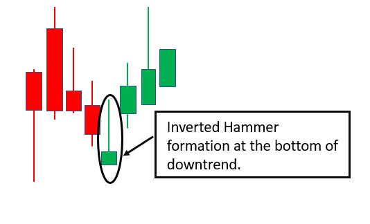
#3. Inverted Hammer
An inverted hammer at the bottom of a downtrend is a bullish trend reversal signal. It indicates that the buyers were able to resist selling pressure as sellers were not able to take the price down much.
If there is a green candle after the inverted hammer, it would give further confirmation of a trend reversal.
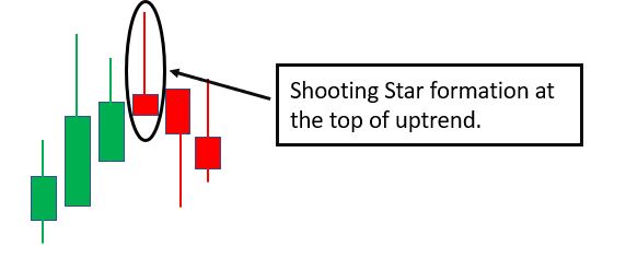
#4. Shooting Star
The inverted hammer formation at the top of an uptrend is called a shooting star. It is a bearish trend reversal signal. The long upper wick indicates that the buyers were not able to take the prices up, as sellers are gaining control.
If there is a red candle after the shooting star, it would give further confirmation of a trend reversal.
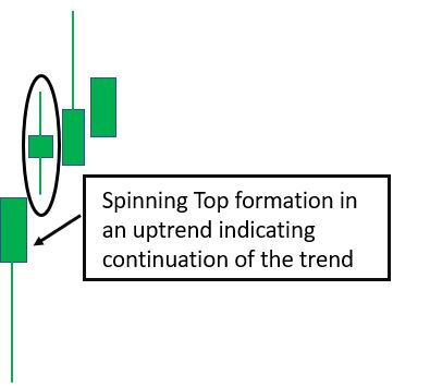
#5. Spinning Top
A spinning top is indicated by a short body candle with a long upper and lower wick. This candle indicates that neither the buyers or sellers could gain control and hence, the opening price and closing price were close to each other.
A spinning top shows indecision and might be a neutral candlestick indicating a pause in the trend or a continuation.
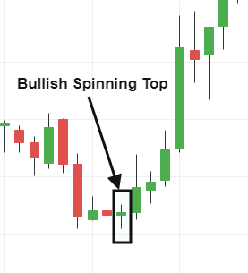
#6. Bullish Spinning Top
A spinning top at the bottom of a downtrend could indicate a potential trend reversal. If there is a spinning top after a continuous downtrend and the candle after the spinning top is a green candle, it may be a sign of trend reversal.
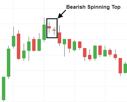
#7. Bearish Spinning Top
A spinning top at the top of an uptrend could indicate a potential trend reversal. If there is a spinning top after a continuous uptrend and the candle after the spinning top is a red candle, it may be a sign of trend reversal.
#8. Doji Candlestick Pattern
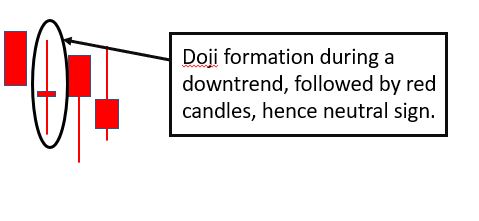
The Doji is formed when the opening and closing price of a candle is almost the same. Thus, the candle looks like a ‘+’ sign. The Doji might be a red or green candle, representing indecision in the market, i.e. neither the buyers or sellers are in control.
A Doji formation at the top or bottom of a trend generally indicates a trend reversal. To better understand it, look at the above image. Each green candle is clearly showing that the buyers are taking the price higher.
But then there is a Doji, where the buyers have been unable to take the price higher like in the previous green candles, which signals that the sellers have come in action. Thus, prices have come down following this Doji.
A Doji can also sometimes be a neutral sign indicating pause or pullback in a trending market.
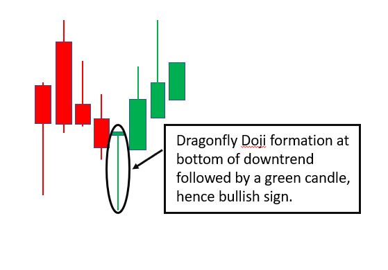
#9. Dragonfly Doji
A dragonfly doji looks like a ‘T’ sign. The dragonfly doji at the bottom of a downtrend could mean that price may gain strength in the near term.
It indicates that the sellers tried to push the prices lower, but could not do so because of the buyers’ strength.
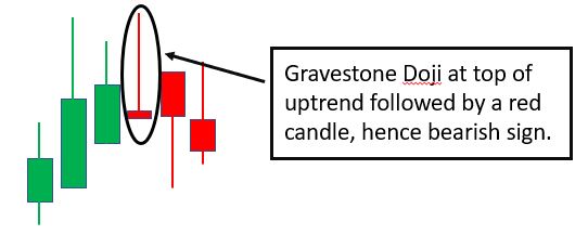
#10. Gravestone Doji
A gravestone dragonfly doji looks like an ‘inverted T’ sign. The gravestone doji at the top of an uptrend could mean that the price may weaken in the near term.
It indicates that the buyers tried to push the prices upwards, but could not do so because of the sellers’ strength.
#11. Marubozu Candlestick Pattern
A marubozu is a full body candle with no upper or lower wick. The marubozu candle indicates strong buying or selling.
If the marubozu is green, it means that there is strong buying as the prices have closed at the highest price of the particular time frame.
If the marubozu is red, it means that there is strong selling as the prices have closed at the lowest price of the particular time frame.
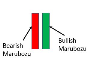
A green marubozu at the bottom of a downtrend may indicate a possible uptrend reversal. If it appears during an uptrend, it indicates the continuation of the uptrend.
A red marubozu at the top of an uptrend may indicate a possible downturn reversal. If it appears during a downtrend, it indicates a continuation of the downtrend.
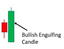
#12. Bullish Engulfing
A Bullish engulfing candle is a big green candle that is preceded by a smaller red candle. The green candle should be longer than the red candle, completely engulfing it at both the upper and lower end.
The candle opens lower than the closing price of the previous red candle but closes higher than the opening price of the previous red candle. The bullish engulfing candle can be a sign of a trend reversal when it appears at the bottom of a downtrend.
#13. Bearish Engulfing
A Bearish engulfing candle is a big red candle that is preceded by a smaller green candle. The red candle should be longer than the green candle, completely engulfing it at both the upper and lower end.
The candle opens higher than the closing price of the previous green candle but closes lower than the opening price of the previous green candle.
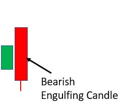
The bearish engulfing candle can be a sign of a trend reversal when it appears at the top of an uptrend.
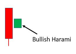
#14. Bullish Harami
A bullish harami is a small green candle appearing after a big red candle. The length of the body of the green candle is approx. 1/4th of the body of the preceding red candle.
This pattern appearing after a downtrend can be a bullish sign.
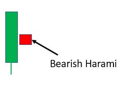
#15. Bearish Harami
A bearish harami is a small red candle appearing after a big green candle. The length of the body of the red candle is approx. 1/4th of the body of the preceding green candle.
This pattern appearing after an uptrend can be a bearish sign.
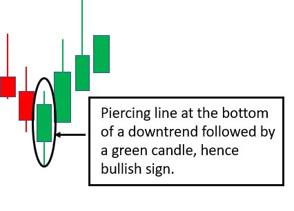
#16. Piercing Line
A piercing line is a bullish pattern appearing at the bottom of a downtrend. In this pattern, a green candle opens lower than the preceding red candle but closes above 50% of the length of the red candle.
The pattern is confirmed when the next candle after the piercing line is also green and makes a high above the piercing line candlestick.
#17. Dark Cloud Cover
This is a reversal formation, represented by three candles. In this pattern, a red candle is formed after three or more consecutive green candles.
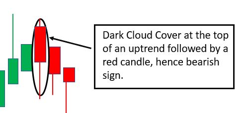
The pattern is confirmed when the next candle after the dark cloud cover is also red and fails to make a high above the dark cloud cover candlestick.
The dark cloud cover candle indicates that the buyers tried to take the prices higher (denoted by the higher opening price of the red candle) but sellers have gained control as they took the prices substantially below the opening price, thus forming the dark cloud cover candle.
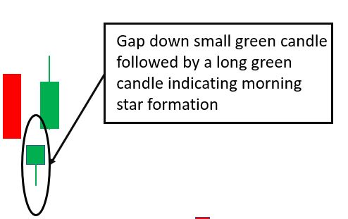
#18. Morning Star
This is a 3-candle pattern which is an indicator of a trend reversal when it occurs after a downtrend. The first candle is a long red candle followed by a gap-down small green candle. The third candle is a gap-up long green candle.
The morning star indicates that the buyers have taken charge and hence, a possible bullish sign.
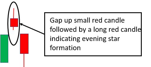
#19. Evening Star
This is a 3-candle pattern which is an indicator of a trend reversal when it occurs after an uptrend. The first candle is a long green candle followed by a gap-up small red candle. The third candle is a gap-down long red candle.
The evening star indicates that the sellers have taken charge and hence, a possible bearish sign.
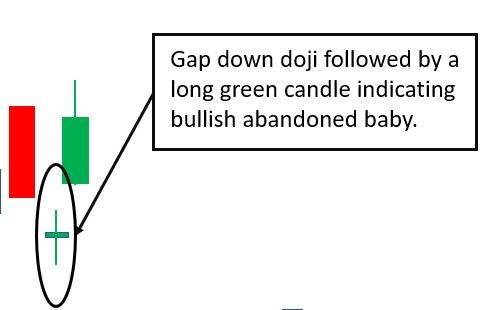
#20. Bullish Abandoned Baby
This pattern is similar to the Morning Star pattern. The difference is that the second candle is a doji instead of a small green candle.
This type of pattern after a downtrend is a sign of trend reversal.
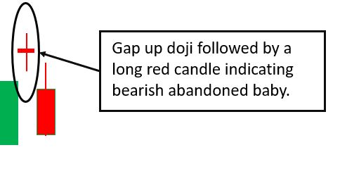
#21. Bearish Abandoned Baby
This pattern is similar to the Evening Star pattern. The difference is that the second candle is a doji instead of a small red candle.
This type of pattern after an uptrend is a sign of trend reversal.
#22. Three White Soldiers
This pattern indicates a reversal when it is formed after a downtrend. In this pattern, there are three consecutive green candles.
Each candle’s opening price is higher than the previous candle’s closing price. Also, each candle’s closing price is higher than the previous candle’s closing price.
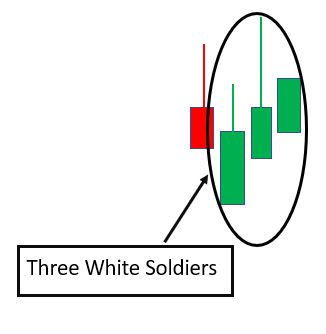
This type of pattern is generally a strong indicator of a trend reversal because each red candle in this pattern is closing lower than the previous candle which indicates strong selling in the market.
A good entry point to trade this pattern would be when the fourth candle after the three white soldiers appears to be closing in the green.
#23. Three Black Crows
This pattern indicates a reversal when it is formed after an uptrend. In this pattern, there are three consecutive red candles.
Each candle’s opening price is lower than the previous candle’s opening price. Also, each candle’s closing price is lower than the previous candle’s closing price.
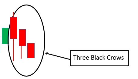
This type of pattern is generally a strong indicator of a trend reversal because each red candle in this pattern is closing lower than the previous candle which indicates strong selling in the market.
A good entry point to trade this pattern would be when the fourth candle after the three black rows appears to be closing in the red.
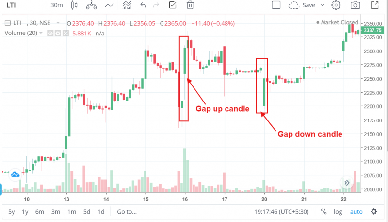
#24. Gap Up and Gap Down
When a new candle forms at a gap above the preceding candle, it indicates the strong bullish sentiment. It means that the buyers are willing to buy at a higher price than the last traded price and might be an indication that the stock will go up further.
Similarly, if it forms at a gap below the preceding candle, it indicates strong bearish sentiment indicating the possibility of further decline of prices.
How to Analyse Candlestick Chart Patterns for Day Trading
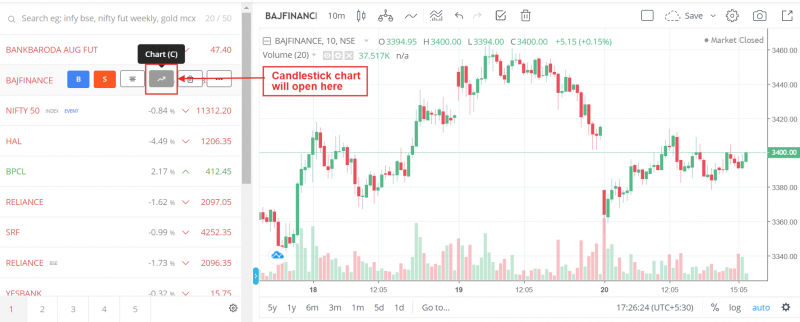
You can get real-time candlestick charts of any stock in your trading platform.
I am using the Zerodha Demat account to show the candlestick analysis process. You can open an account with Zerodha If you are looking to open a Demat account.

Best Discount broker in India
Zerodha Demat Account
- Fix Rs. 20 per trade on intraday trades
- Zero brokerage on the stock delivery
- Good customer support
- Best charts and tools for technical analysis
You just need to search the stock name in the search bar and scroll over the stock name to open the candlestick chart of the particular stock.
#1. Understand the Time Frames
Candlestick Charts are of different time frames. For day trading, 5-min, 10-min or 15-min candlestick charts are used, if you want to enter and exit a trade within a few minutes by taking advantage of small fluctuations in prices. This is called scalping.
For example, a stock like Reliance continuously moves 2-3 rupees up and down almost every minute. If you want to capture this Rs. 1-2 price movement, you can use 5-min or 15-min charts.
If you wish to capture a larger movement of prices, you can use 30-min, 1 hour, 3 hour and Day charts to study the price action.
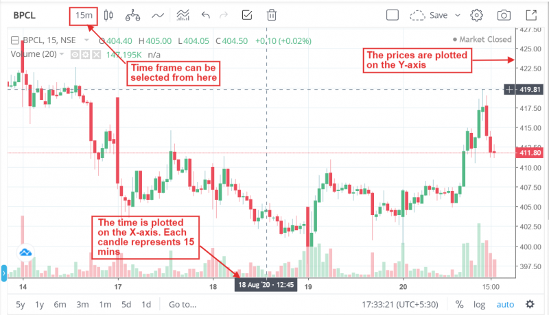
On a candlestick chart, the time is plotted on the x-axis and the prices on the y-axis. So, the candlesticks get plotted along the time scale as per the range of trading prices.
#2. Know What is Price – Action Analysis
You get the understanding of price action by reading the candlestick chart.
In trading circles, it is said ‘Bhaav Bhagwan hai’. This means that ‘Price is God’. You can make a prediction of the stock price in the near future by observing the current price fluctuation of stock.
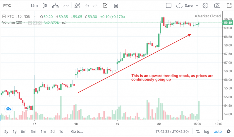
In day trading, the main goal is to identify the ‘trend’ of the stock i.e. whether the stock will go up or go down. Price action analysis will help you do that. If a stock seems to be going up, it is on ‘uptrend’.
If the stock seems to be going down, it is said to be on ‘downtrend’.
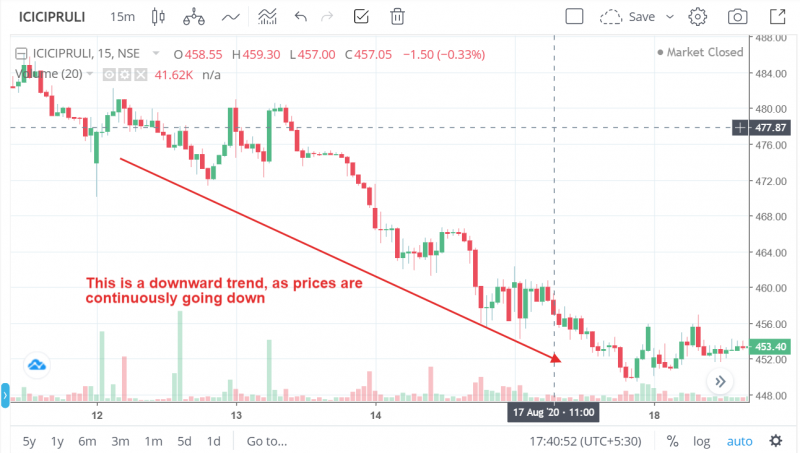
Once you are able to identify the trend of the stock, you can enter a trade in the stock to ride the trend. For instance, if a stock is on an uptrend, you can go long (i.e. buy trade) in the stock and exit the stock after capturing a part of the up move.
#3. Learn About Bullish and Bearish Candles
The strength of the buyer and sellers influenced the stock price movements. If buyers are stronger, the candlesticks will be ‘bullish’, and if sellers are stronger, the candlesticks will be ‘bearish’.
Candles with full bodies represent strong buying (if green candle) or strong selling (if red candle). This is because a full-body candle basically means that the stock has traded at all prices in a particular time range, representing strong buying or selling.
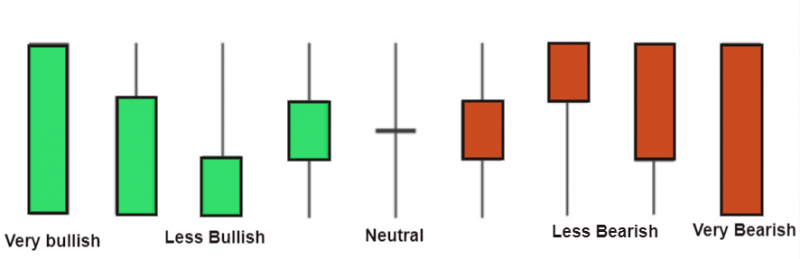
If a candle has a long upper and lower wick, it indicates volatility in prices as it means that the price has gone up and down a lot but has not sustained at either level.
Candles with a body at the upper end with a long lower wick indicate bulls are in control. Similarly, candles with a body at the lower end with a long upper wick indicate bears are in control.
You will not be able to decide whether a stock is bullish or bearish just by looking at 1 candle. You will have to analyze a series of candles to analyze the price action in the stock.
#4. Understand Trend, Corrections and Consolidation
A candlestick chart tells you a story about the stock price. If you are able to read the story well, you can make a winning trade.
1. Trends and Corrections
If the stock price is continuously going up or down over a period of time, it is showing a trend. The trend could be for a day, a week, a month or even a year.
But a stock will never continuously keep going up or down. There are periods of correction during a trend when the price will move in the opposite direction for a while before continuing the original trend.
If the correction continues for a long period of time, it might be an indication of a trend reversal.
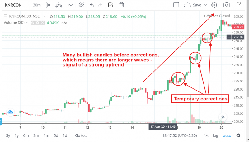
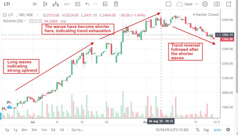
If you look at the candlestick chart entirety, you will see the signs of the end of a trend. If you observe a trend, it will appear like a wave.
For instance, in an upward trend, there will be a series of bullish candles and then some correction candles before there is a series of bullish candles again.
Longer waves indicate stronger trends. If the waves get shorter, it might be a signal of trend exhaustion and possibly the end of a trend.
Let’s say Cipla stock opens at Rs. 700 on market opening which is 2% above the previous day’s closing. It keeps going up till it hits Rs. 720. Then it corrects and comes back to Rs. 710.
At the end of the day, the stock closes at Rs. 725. In this example, the stock was on an upward trend but the retracement to Rs. 710 was a temporary correction.
2. Consolidation
There are phases of consolidation when the price moves in a narrow range and does not give much opportunity to make a profit.
In a consolidation phase, neither the buyers or sellers are in control. Once one side takes control, there is a ‘breakout’. A breakout can be the beginning of a new trend.
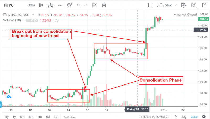
Let’s say ITC stock opens at Rs. 190 and goes up to Rs. 193. Then it comes down to Rs. 189 and sustains in the range of Rs. 189-192 before finally closing at Rs. 191.5. In this example, the stock is said to be in ‘consolidation’.
Expert Advice
You see one of the candlestick patterns mentioned above, does not mean that you can blindly enter a trade. For instance, just because there is a bullish hammer formation at the bottom of a downtrend does not necessarily mean that you will definitely make a profit if you go long.
You should not take action just by looking at one candlestick pattern. You should wait for a few candles to confirm your view about the trade, especially in the starting phase.
You will also need to look at the market conditions in the entirety to formulate your trading strategy.
For instance, if there is some news during market hours that can cause sudden negative/positive sentiment in the market, (like Indo-China border tension, trade war, regulatory changes, company declared a stock dividend) no matter what the technical chart was indicating earlier, the prices will react to the news.
Good traders often use technical indicators in addition to candlestick patterns to plan their trades. You can easily start earning Rs 1000 daily in intraday trading if you learn how to combine candlesticks with trading strategies.
Do you find Pmnews.ng, Best information Website on Insurance, Investment, Healthy Tips useful? Click here to give us five stars rating!